Crafting a premium digital experience for India's most exclusive credit card.
Role
Industry
Timeline

The Challenge
SBI Card, India's second-largest credit card issuer with over 20 million cards in circulation, approached our team with a significant challenge: How might we create a digital experience for their new flagship AURUM credit card that feels truly premium while maintaining consistency with their existing digital ecosystem?
Understanding the Problem Space
Before jumping into design solutions, I conducted comprehensive research to understand:
The current premium credit card landscape in India (discovering it was relatively sparse)
UI/UX trends across other premium domains
SBI Card's existing design patterns and user expectations
This research revealed a key insight: we needed to balance creating a distinct premium identity while maintaining cohesion with SBI Card's established digital presence.
The Design Process
Initial Approach: I started with SBI Card's familiar blue and white colour scheme while proposing a new layout structure. This allowed us to test new navigation concepts while keeping some visual consistency.
Pivot Point: When the card name AURUM (Latin for "gold") was finalized, I recognized an opportunity to elevate the premium feel through a gold and black color scheme. Rather than completely redesigning components, I adapted existing ones with this new palette to maintain system consistency.


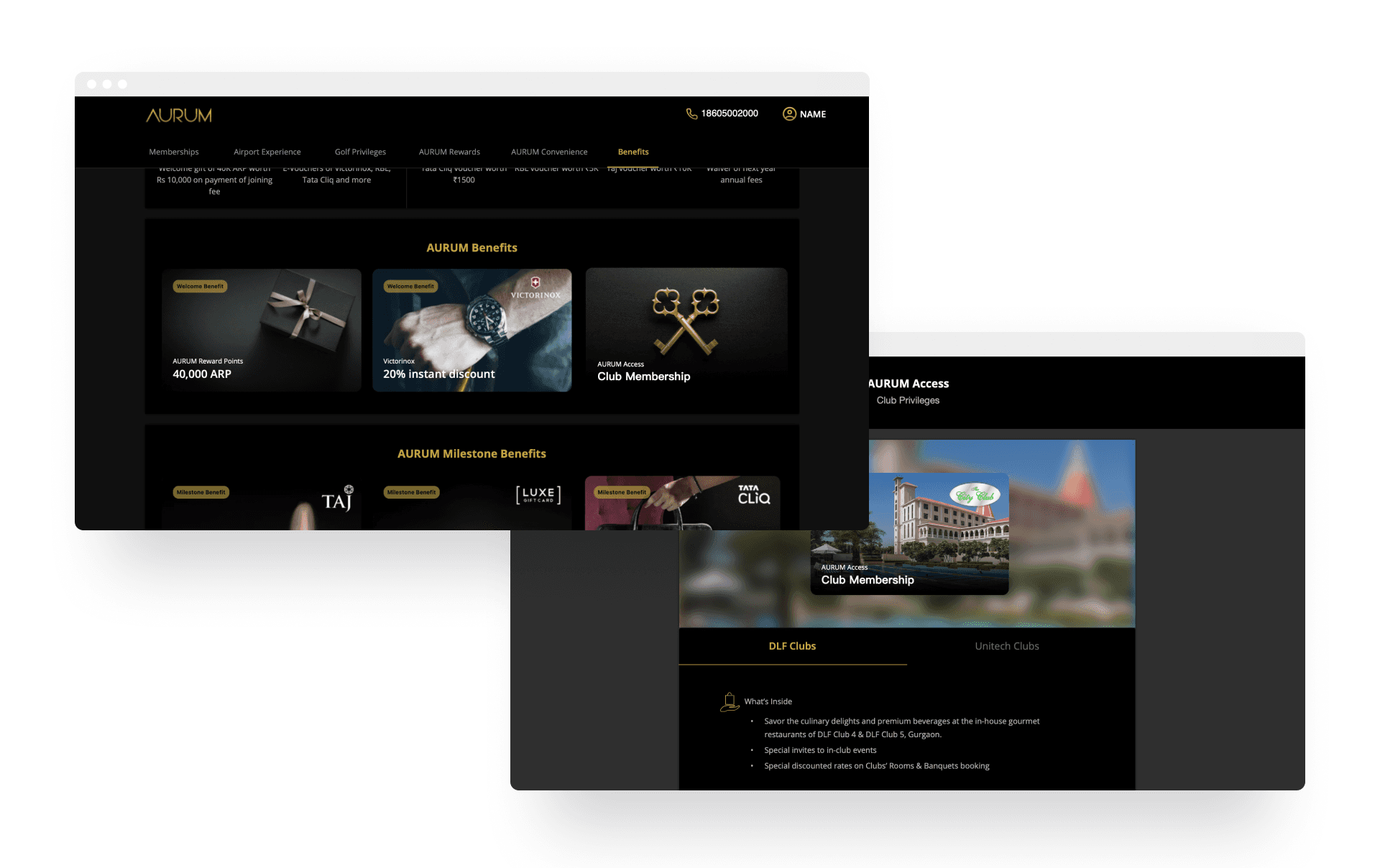
Solving the Post-Login Challenge
The most complex problem emerged in the post-login experience: how to present numerous memberships and vouchers without overwhelming users.
My Solution: I developed a double navigation system where:
Memberships were first categorized, then displayed as cards (referencing physical membership cards)
Vouchers mimicked physical discount vouchers
Mobile views stacked elements similar to credit cards in a wallet
To improve the user journey, I:
Created membership hub pages with all details in one location
Implemented inline forms to reduce navigation friction
Structured content in a logical flow (perks → application → terms)
Added generous spacing to prevent information overload
Developed custom line icons for each perk to maintain visual consistency while highlighting uniqueness
For the vouchers page, I introduced gamification through a timeline of spend milestones, encouraging users to progress through spending levels to unlock better rewards.
Results and Learnings
This project taught me valuable lessons about balancing brand consistency with creating premium experiences. The double navigation system proved particularly effective in user testing, with users appreciating the intuitive organization of complex information.
The most significant challenge was maintaining cohesion across the entire digital ecosystem while creating something that felt special and exclusive. This required constant collaboration with the SBI Card team and iterative testing of our solutions.
