At Thrive, I designed for the dilemma of deciding what to eat, grounding the work in research, human behavior, and trust.
Senior Product Designer
Consumer Social Product
July 2022 - December 2023

Thrive was a direct-ordering platform in a rapidly growing delivery market. Ordering was easy, but discovery hadn’t evolved.
Users spent more time deciding than ordering. My challenge was to reframe this ambiguous problem and design a trusted, human-centric discovery experience.
I led the end-to-end design process: reframing the problem, conducting primary research, discovering how users actually made food decisions, and translating those insights into a social discovery layer integrated into Thrive’s ordering ecosystem.
The launch reached strong early adoption and community love. More importantly, I developed a mature design process grounded in problem framing, insight-driven strategy, and thoughtful interaction design.
India’s delivery market was exploding, but users still faced the same question every day:
“What should I eat?”
Existing platforms served infinite lists, generic suggestions, and questionable reviews. Their algorithms optimized for visibility, not taste.
Thrive had already existed in the food delivery space as a direct delivery platform, but their foray into restaurant aggregation was new. They wanted to stand out in a saturated market by creating a food delivery app that made discovery as easy as ordering.
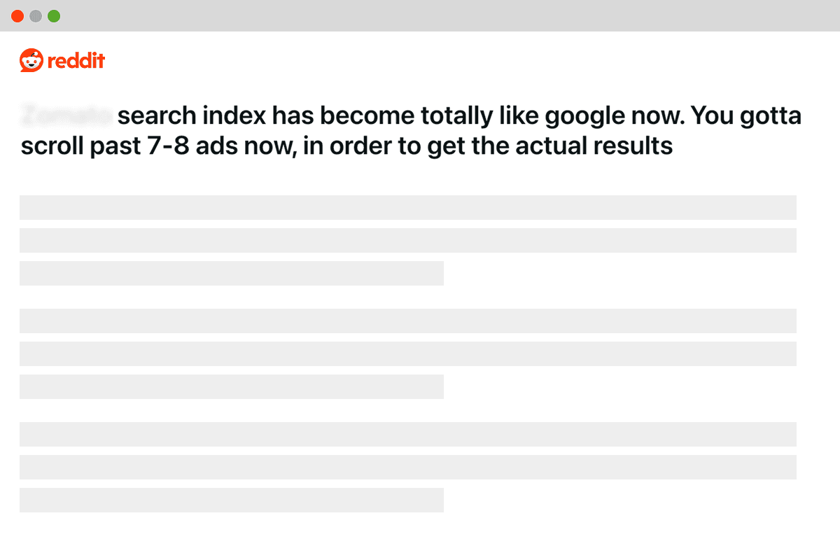
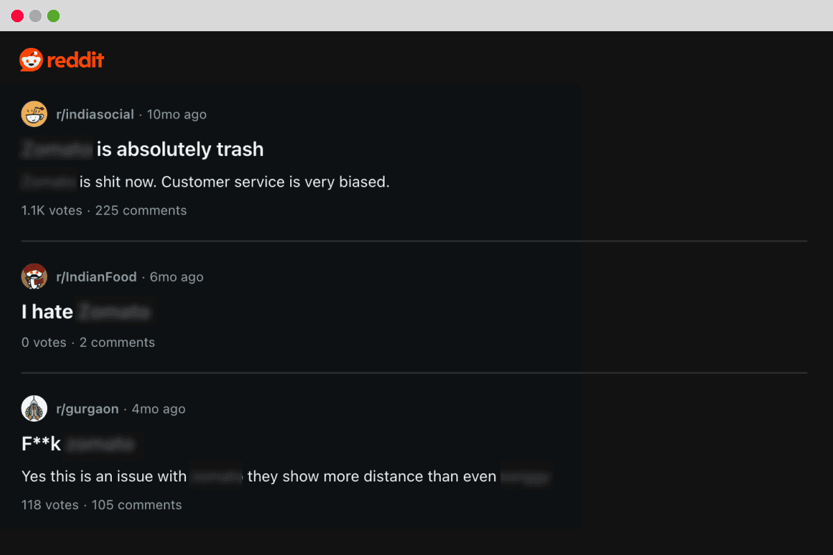
Users' dissatisfaction with the existing food ordering ecosystem was becoming increasingly visible on social media.


Preliminary research validated our initial hypothesis. Sponsored listings made finding actually good food hard, and fake reviews and ratings muddied the waters even more. Users' trust in the food delivery ecosystem had slowly been eroded.
This lack of trust informed our problem statement.
My research goals were simple:
Find hidden behaviors, not validate features
Understand emotional triggers
Map decision journeys from craving → order
I used secondary research (Reddit, Facebook groups) and primary research (1:1 interviews, Zoom calls, street intercepts) to build a real picture of user behavior.
Users' dissatisfaction with the existing food ordering ecosystem was becoming increasingly visible on social media. I scoured online discussions, reviews and news articles, and conducted interviews with users to sharpen the problem direction.
Through my research, I uncovered my guiding insight.
Research revealed that people were not always using apps to find food. Instead, they were:
Asking friends on WhatsApp
Digging through screenshots
Checking Instagram stories
Consulting group chats
People may pick restaurants from a generic list when they're in a hurry, but when food truly matters, they ask their network. This finding showed up over and over through my research, on social media, on calls, and in person.
Our target audience already knew how to discover restaurants through friends, conversations, and recommendations from people they trusted. Research consistently shows that interfaces matching existing mental models reduce friction and speed up adoption. The design principles follow that logic: make the app feel like something users already know how to use.
I explored several design directions.
Chatbot-style conversations
Card carousels
Social feeds
We tested each direction with users through low-fidelity prototypes to see if it's something users might enjoy.

Chat-, card-, and feed-based explorations, and why they didn't work
For my MVP, I wanted to target early adopters — people who really cared about food, and who'd be open to downloading a new app that made their discovery experience better. I zeroed in on two key personas:
THE CURIOUS EXPLORER
🕵️♀️
Looking for the best possible meal, this persona peruses reviews and asks their friends for recommendations.
THE DINING CONNOISSEUR
🦸
I then designed two features, each targeting one of these personas.
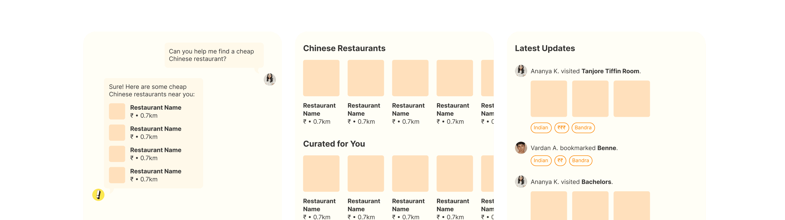
Users were already asking friends for where to eat, just across different apps. Recommendations recreated that behavior inside Thrive.
It was intentionally minimal and conversational. No heavy filters, no platform-driven rankings. Just trusted suggestions from people users already rely on.


Users curated lists everywhere — screenshots, Maps stars, WhatsApp notes. The Lists feature transformed this messy behavior into a structured, flexible personal library.
I designed Lists to be expressive and identity-driven:
Moods: “Comfort food tonight”
Occasions: “Date night spots”
Personas: “Places to take out-of-towners”


I modeled the feature on behaviors users were already familiar with through other social apps like Reddit and WhatsApp, reducing the learning curve and friction for using Thrive.


Through a stellar MVP and dedicated customer outreach, we exceeded our goal for monthly active users, and social feed engagement. What surprised us was that not only were new users signing up, they kept coming back, again and again.
Although the company eventually shut down for market reasons, the product itself resonated deeply with early users. People shared lists, added friends, and treated discovery as a social, identity-driven experience.


Designing Thrive’s discovery component challenged my assumptions and sharpened my craft, and it remains one of my most formative projects.
This project taught me a lot, shaping my future design practice.